In this week’s free episode of Deke’s Techniques, Deke uses Adobe Illustrator to create an intriguing (TM Deke) cubical logo.
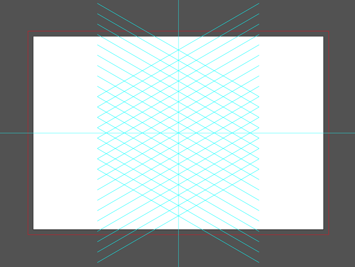
While the bulk of the exercise is really drawing with the pen tool and figuring out (with your artistic-spatial abilities) what color each "side" should be, the real infrastructure here is provided by an intricate set of snap-able guides. And thanks to Illustrator’s reflect and rotate tools, you can draw this yourself using math and a little organization.
Then, the sides and corners are traced and filled with the pen tool:
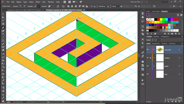
And in the end, you have this compelling cube:

If you’re a member of Lynda.com, Deke’s got an exclusive movie this week in which he shows you how to take unfortunately mitered corners like these:
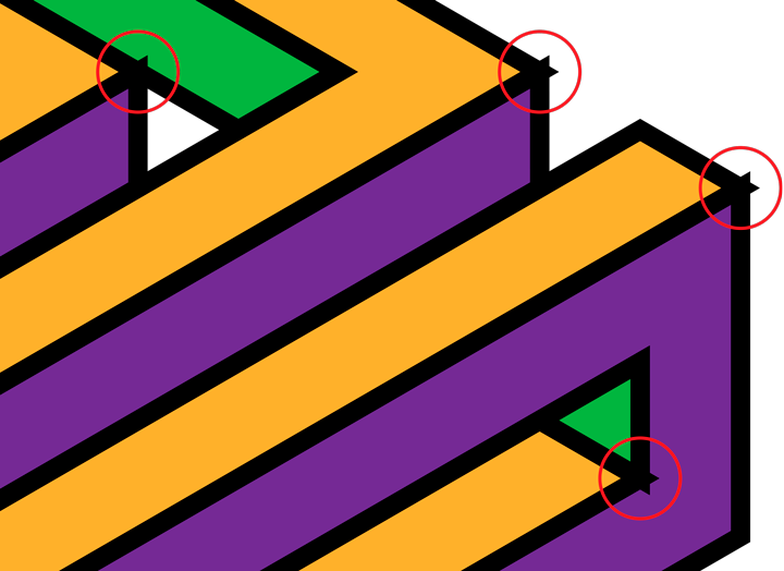
And turn them into beautifully aligned corners like these:

Deke’s Techniques, walking you through cubic space so you don’t lose your way.



Is it just me . . . the video for this tutorial does not play.
Thanks, Kate!
Still sorting it
Such an amazing design!
Thank you!