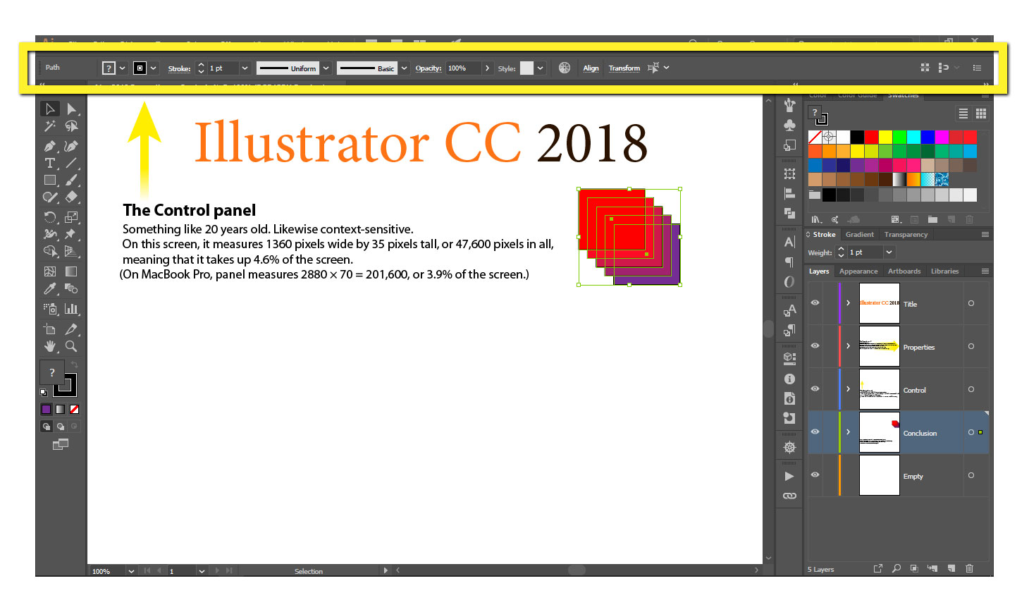
Welcome to the first Deke’s Techniques of the new year and our newly redesigned site. In this week’s free Deke’s Techniques episode, Deke takes on the new Properties panel in Illustrator CC 2018.
The Properties panel is Illustrator’s new context-sensitive panel that changes offerings as you change tools. Deke and I sometimes call it the Panels panel. But if the former description sounds familiar, yes, it is (at this point) a vertical screen space—hogging variation on the 20-year-old, unassuming Control panel that used to sit at the top of the interface by default.

So, in the name of fairness, Deke takes you on a brief tour of one incarnation of the Properties panel, even pointing out one nice feature that it displays when you have the Black Arrow tool at hand (namely, you can change your keyboard increment settings without having to bring the Preferences dialog box).
And then, he shows you how to efficiently return the Control panel to the top of the screen, so you can designate your screen property as you see fit (hint: try the Layers panel).

If you’re a member of Lynda.com or LinkedIn Learning, Deke’s got an exclusive movie this week in which he shows you how to downsize the massive Properties panel and generally set up a workspace that lets you see everything you need.
Deke’s Techniques, keeping your Illustrator property under control.


Putting the Property Panel in It's Place
Good name for a workspace, @Thomas!
good luck!