Recently, longtime deke.com member Petra Zoe asked the above and then graciously allowed us to quote her, because we never could have captured such charming angst on our own.
Quick Answer:
Couldn’t have said it better myself. Especially given that this is not a glitch, but an intentional feature, designed for your enjoyment by the good people at Adobe. Because I can’t help myself, I’ve got the Grouchy Old Photoshop Guru explanation below. But the bottom line is that Adobe’s built-in workspaces actually reset the toolbox to theoretically limit you to only that which you need. So if you select, say, the Photography workspace, as Petra did, Adobe figures you don’t need the Paint Bucket tool. Among the defaults, the Essentials workspace is the only one that gives you all the tools—and even then, choose Window > Workspace > Reset Essentials to ensure you’ve got the factory setting.
My recommendation: Don’t select one of Photoshop’s predefined workspaces. Create your own, as I document in my movie “Panels and workspaces —do not skip!” which is part of Chapter 2, “Getting Around,” of my course Photoshop CC 2018 One-on-One: Fundamentals.
Note from Colleen: Petra mentioned that she usually creates a custom workspace but hadn’t had time after her latest Photoshop installation. And thus it explains why she’s only now tormented by a “feature” that’s been around for a few years now. I couldn’t believe that “contextual interfaces” had gone so far over to the dark side. But my job is sometimes dependent on pretending to be Deke, and so I’m forever forced to watch and follow his movies—well, at least the ones for which the words do not skip are included in the title. And thus I have been spared the Lost Tool Syndrome (unless you count the elusive set of Allen wrenches that we can never find when the bikes need adjusting).
The Back Story
In November of 2015, Photoshop CC helpfully introduced the Edit > Toolbar command, which lets you turn tools on and off in the vertical toolbox.
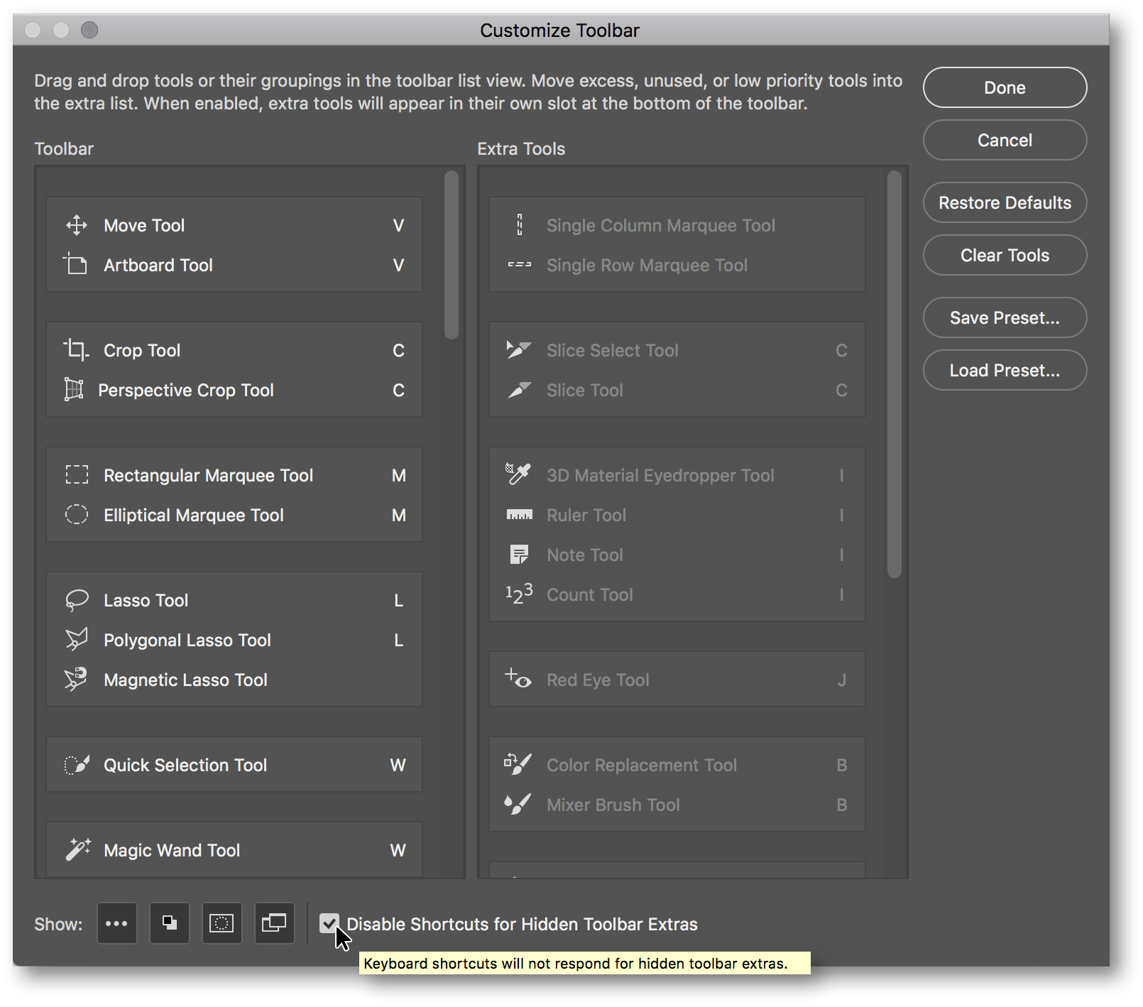
With the obvious exception of the command’s name—it’s not a toolbar, a bar is by definition horizontal (think bar graph vs column graph)—I’m a fan of this feature. Drag a tool from the left column to the right one (see below) to hide it. Select a tool’s keyboard shortcut and change or delete it. Drag a tool up and down the list to group, ungroup, or move it. Drag an entire tool group even.

And don’t forget to select that check box down there at the bottom to turn off the keyboard shortcuts for hidden tools—or as Adobe calls them, Hidden Toolbar Extras like that makes
any goddamn sense—b/c otherwise you might select everyone’s favorite the Count tool by tapping Shift-I.
Good news: You can use Edit > Toolbar to slim Photoshop’s toolbox down to just those tools you use on a regular basis. You can likewise adjust your staff’s toolboxes to match yours with an eye toward enhancing efficiency. Or your mom’s for easier over-the-phone tech support.
Better yet, you can save your toolbox settings along with a custom workspace.
BAD NEWS: All of the default workspaces except Essentials include abbreviated toolboxes. The Graphics and Web workspace hides the Paint Bucket tool. The Photography workspace turns off the tool and disables its shortcut, Shift-G.
I love Photoshop. As I’ve said many times, I believe Photoshop to be the best computer application on the planet. I love Adobe. On balance, I believe Adobe to be the best software developer on the planet. The brilliant people at Adobe are amazing innovators.
Which is to say, Adobe excels at power. But simplicity? Not really the company’s forte. And when they try, they often screw things up.
Take the Edit > Toolbar command: It gives you the power to modify Photoshop to better suit your specific needs.
Compare this to the Photography workspace: It simplifies Photoshop by combining the Histogram and Navigator panels which have nothing to do with each other, offering up the Clone Source panel which ranks among the most rarefied features in the software (so beginners rejoice!), and squirreling away a bunch of useful tools so you can’t fucking find them.
Edit > Toolbar comes to us from the engineering team. The Photography workspace comes to us from the marketing dept.
My recommendation: Don’t select one of Photoshop’s predefined workspaces. Create your own, as I recommend in my movie “Panels and workspaces,” which is part of Chapter 2, “Getting Around,” of my course Photoshop CC 2018 One-on-One: Fundamentals.
My only criticism of Edit > Toolbar? You can’t change the name of a tool. Like the whimsically monikered Quick Selection tool. If you could rename that tool, what would you call it? The Unreliable Selection tool? The Shilly-Shally Selection tool? The Brushy-Little-Shitty-Rarely-Selects-What-You-Want Selection tool?
By contrast, the Paint Bucket tool and its cousin the Magic Eraser tool are based on the same technology as the Magic Wand tool, a frequently maligned tool that—while ancient in its approach—gives you all the predictive control you might ever hope for in the form of the Tolerance setting.
I’m not necessarily telling you which tools to like. But I am telling you how to hide them—or turn them back on—with Edit > Toolbar.
One thing I definitely like: Petra. Thanks for the conversation starter and reminder that even seasoned Photoshop users can be taken off guard by “helpful” new features.


That seemed simple, but what about the Web Contact Sheet?
Petra Down Under Never Ceases to Amuse and Amaze