In this week’s free Deeeek’s Techniques episode, Deke enhances our “candy keeper” (the guardian of your giant bowl of candy for trick or treaters that we created last week) into a full-fledged horror movie poster, notably by adding creepy creases and eerie edges to the project.
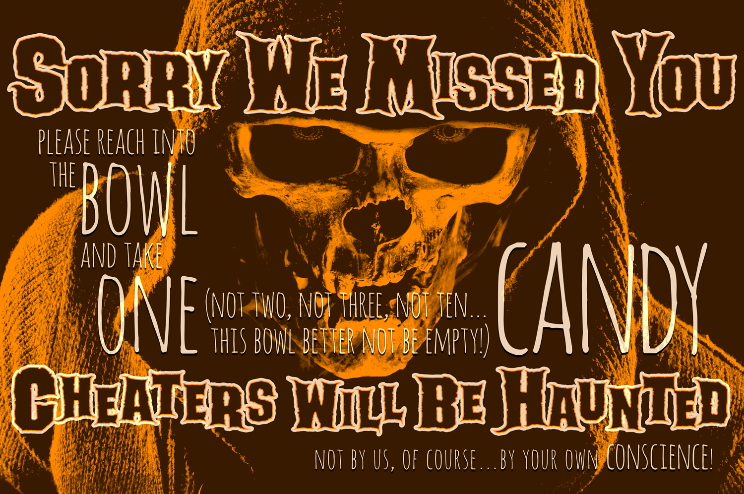
You’ll recall, last week, we left the project like this:

Cool sure, but not legit enough to guard our full-size unattended candy bars from the most dedicatedly acquisitive of trick-or-treaters.
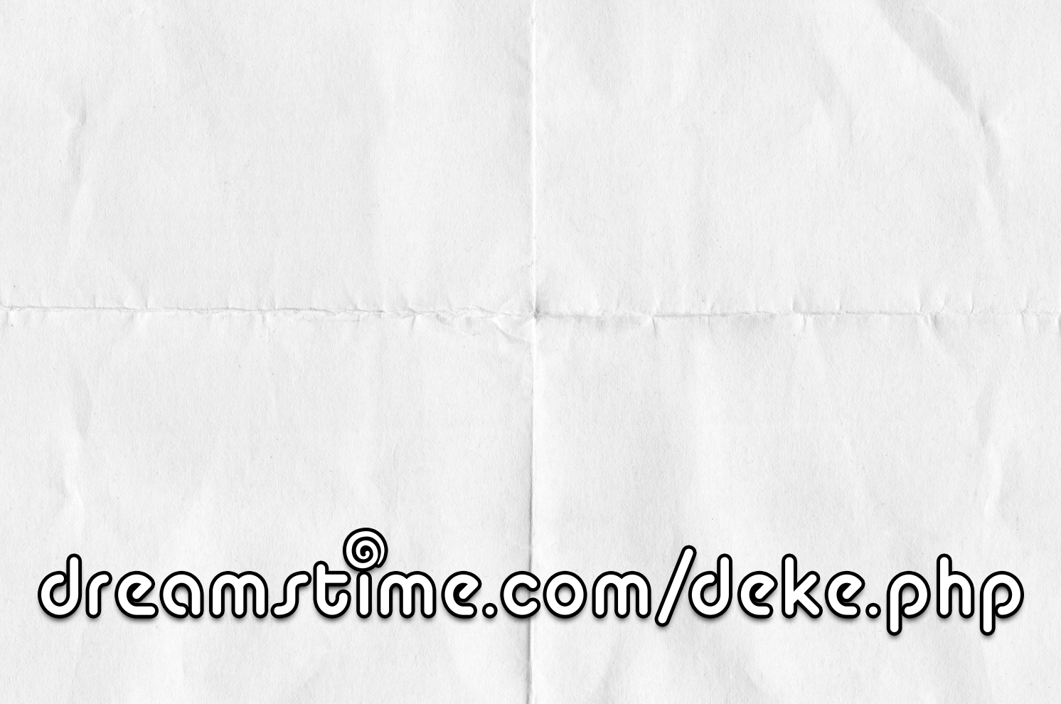
To add the edges and folds, Deke enlists the help of our friends at Dreamstime.com (about which you can learn more and get deals here). First, using the aged edges featured in this image:

And then adding creases (combined with some heavy duty Calculations manipulation) from this creation:

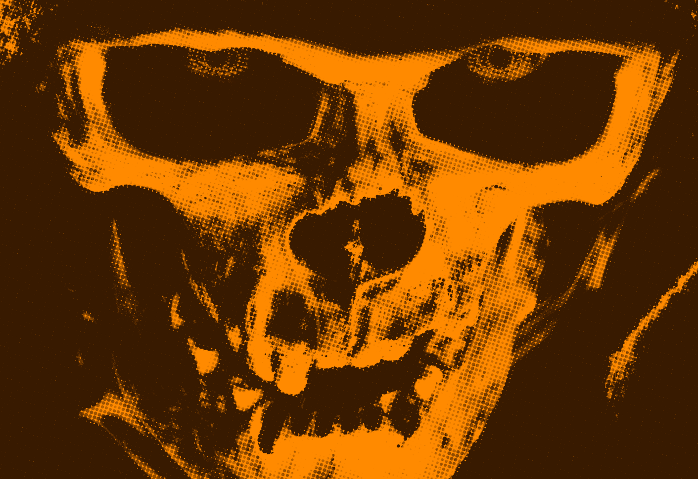
Of course, no project that is specifically designed to scare the kids off from stealing all the candy is fully realized until you add menacing half-tone dots, which Deke demonstrates in this LinkedIn Learning (Lynda.com) exclusive movie:

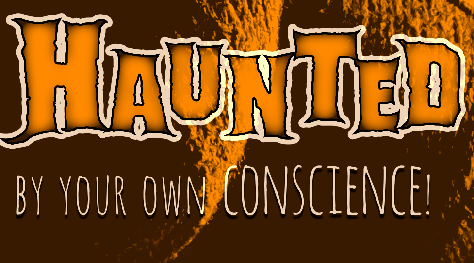
And because Deke doesn’t feel like Halloween has been fully graphically celebrated without at least two extra movies, he’s got two more exclusive movies for members this week. In the second, he shows you how he enhanced the word Haunted to look particularly, well, haunted.

And in the third, he shows you how he magically makes the letters on the poster edges go outside the supposedly aged edge effects. How would they do that? Spooky magic, of course. And the fact that in Photoshop “looking cool” transcends logic, especially in dekeOphoria.
Deke’s Techniques, where ghouls and goblins wait all year to be celebrated.


Be the first to drop some wisdom...