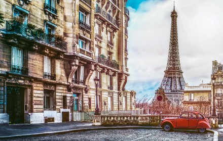
In this article, we’ll add a stock photo of a magnifying glass to a type design, set it up so that the glass magnifies a portion of the text behind it, and add a hint of tint to the glass itself. We’ll also create a custom drop shadow—one that looks realistic—because the default drop shadow doesn’t quite do the job.

Today’s article comes from Deke’s Techniques 062, presented by lynda.com.
We’ll start by opening two files. The first is a Photoshop file containing our type design. The one we used has been rasterized and flattened into a background layer containing all the text plus a colored swoosh that is in its own layer. It will be our master file. The other file is a photo of a magnifying glass. We used one from the Fotolia image library, e.g. #26945746.

We’ll combine the two files by duplicating the background of the magnifying glass file directly into our master file.
- Activate the magnifying glass image
- Right-click (Control-click on the Mac) on the background layer (not on its thumbnail) and choose Duplicate Layer from the menu that appears. A dialog will open.
- Select your main document from the destination menu (in our example, it’s called Mostly flat file.psd).
- Name the layer magnifying glass
- Click OK

Now, switch back to your main composition. The duplicate layer will appear there. However, there are a couple of issues:
- The layer is opaque
- The image is too big.

To make the white pixels in the layer disappear, change the blending mode of the magnifying glass layer to multiply.

Now, we’ll scale and rotate the magnifying glass with the Free Transform command:
- Use Ctrl/Command + T or select Edit > Free Transform from the menu bar.
- Shift-drag one of the corner handles to scale the image proportionately. (Deke shrank his about 50%)
- To position the magnifying glass, you can drag, nudge, or bump the layer into place. Tapping any arrow key will nudge the layer in 1-pixel increments. Holding the Shift key while tapping the arrow keys will bump the layer in 10-pixel increments.
- Position the cursor outside the transformation rectangle (the cursor will change to a bent arrow) and drag to rotate the image. (Deke used 17 degrees for our example. I also moved the rotation axis point to the center of the glass so that the handle would swing around the glass once I found a good position for it.)

Next, we’ll add a lens layer:

- Activate the Elliptical Marquee tool.
- Drag out a circle to match the frame of the magnifying glass. Make sure your selection matches the interior of the glass portion.
- Use Ctrl/Command + Shift + N to create a new layer
- Name the new layer “lens”

To add a tint to the lens layer, we’ll fill the selection with gray:
- Tap D to activate the default colors
- Use Alt + Backspace (Mac: Option + Delete) to fill the selection with the foreground color,
- Use Ctrl/Command + D to deselect
- Reduce opacity of the Lens layer (~7%)
- Drag the lens layer beneath the magnifying glass layer

To create the drop shadow effect, we’ll duplicate the magnifying glass layer and blur the copy:
- To duplicate the magnifying glass layer, Alt/Option-drag it below the lens layer.
- Change the name of the copy to “shadow.”
- Bump the shadow layer down and to the right by holding down the Ctrl/Command and Shift keys while tapping the Down arrow and Right arrow keys once each.


(FYI, holding down the Ctrl/Command key temporarily invokes the Move tool. To make the shadow layer look like a shadow, we’ll soften it with Gaussian Blur)
- Choose Filter > Blur > Gaussian Blur from the menu bar
- Set the radius 4px. (*this will vary depending upon your image resolution.)
- Click OK

The final phase of our project is to magnify the portion of the P that appears inside the magnifying glass. Since the text has been rasterized into a layer, it’s already made up of pixels. If you are starting with a text layer in your own version, you’ll want to duplicate it, turn off the original and rasterize the copy. (Right-click/Control-click on the layer label and select Rasterize Type from the menu that appears.)
Create a layer containing the text that will be magnified:
- Click to select the Background layer
- Use the Rectangular Marquee tool to make a loose selection - more than you think you’ll need.


- Copy the selection to the clipboard with Ctrl/Command + C
- Activate the Lens layer
- Ctrl/Command-click the layer thumbnail to load a new selection based on the contents of the lens layer.
- Choose Edit > Paste Special > Paste Into, which will paste the text into a new layer and convert the selection into a mask.
- Name the layer “big P”


Notice that there’s no link between the thumbnail and the mask icon in the big P layer. That means when we move the pixels around, the mask won’t budge. That’s exactly what we want to happen. Also notice the bracket marks framing the corners of the pixel thumbnail. That’s important, because we want to transform the pixels, not the mask.
Now, we’ll magnify and position the text:
- Select Edit > Free Transform from the menu bar or use Ctrl/Command + T.
- Shift-drag the corner of the transfomration box to scale by hand, or click the chain icon in the Options bar to link width and height and then enter a value. (In our example, we dialed-in 172%.)
- Drag inside the transformation box to position the top of the P as needed.

- Hit the Enter/Return key to commit the transformation
- Notice that the big P layer is obscuring the lens and shadow layers. To fix that, just drag the layer beneath the shadow layer.

Now, for one final touch of realism:
We want to lighten the magnified P just a little so that it looks more like we’re seeing it through glass. Reducing the opacity won’t work well, because the underlying P in the original layer will start to show through. Instead, we’ll use the levels command to lighten the pixels in the big P layer.
- Make sure the the big P layer is active, and that the pixel thumbnail is selected, as in the illustration above.
- Choose Image > Adjustments > Levels (Ctrl/Command + L) to open the Levels dialog.
- Set the lefthand Output Levels value to 80, which lightens the darkest values in the layer.
- Click OK to apply.

Here’s the final result, with its beleivable translucency and authentic drop shadow:


OFF TOPIC… Sorry but can you help me Deke?
Hi Deke,
Here’s a problem for you…. I have a friend with an engraving machine that can carve out depth maps and I understand the principles well enough (dark is low and white is high). The end product, although three dimensional, is quite shallow, rather like a medal or coin. He wants me to produce a portrait of a mutual friend in this format. I can light the face from both above and/or below, in a way that accentuated the contours easily enough but that is not the answer. I have considered progressively offsetting and then subtractively blending a stereo pair, to create a set of say-16 contours, then merging them to make a 16-tone posterized image but alas the subjects own brightness’s get in the way. The eyes for example should be almost flat and on the same carved plane, despite the whites and pupils being at opposite ends of the tonal range. Is there any way of doing/faking this adequately, in Photoshop, to help him produse his carved medalion?
Bob (in the UK)
OT Medallion
I dont think that the concepts of lighting and depth mapping are compatible in the way you are approaching it.
if we could post a pic someplace i could do a depthfield render of a poser-person face versus a regular lighting situation. as you are aware you cannot light a face so that the highest point is bright (forehead, tip of nose etc)and lowest point (open mouth for eg) is dark. youo could download the free version of bryce software (daz3d.com) and use the terrain tool(which uses light and dark height maps) to paint a rendition of the subjects face. it would take a lot of adjusting and painting to get there but you would end up with a greyscale result for the etcher.
BTW - a 3d scanner would be the ideal solution but i think that is just a dream for us mere mortals at the moment.
Many thanks biddles
I’ll look into the software you suggest but I guess we photographers just aren’t supposed to be high tech sculptors, after all.
Bob (in the UK)