Like a lot of you, I saw Avengers: Infinity War last week. In fact, I saw it twice. And like a lot of you, I loved it. Some commend it for tying together many of the previous plotlines. Others applaud it for nicely balancing unrelated character groups. And still others like that it makes sense of those crazy infinity stones.
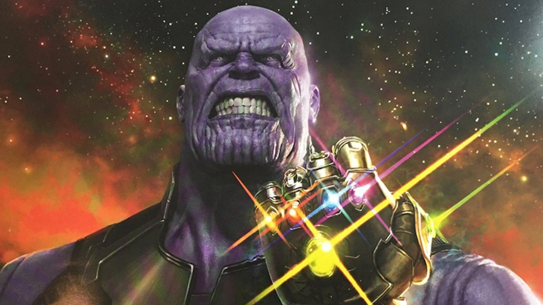
But, me, I like Thanos.
(Note, from this point on, spoilers. Starting with the very next sentence. Spoilers, spoilers, spoilers. Seriously, up to you.)
Here’s a guy who beats the Hulk into permanent submission; throws his adopted daughter Gamora off a cliff; and turns back time to reward himself with a cosmic and from our vantage soul-crushing mulligan.
But mostly, he casually and joylessly kills the shit out of people. Perhaps because he is insane, this is not confirmed.
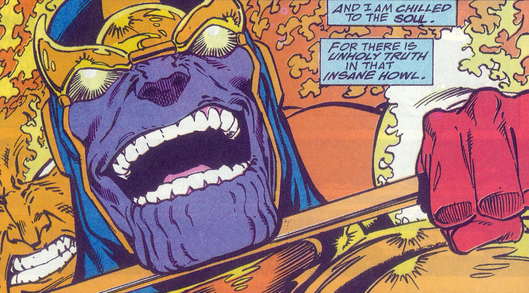
In the end, with a snap of his fingers, he quietly, even gently destroys half of all life in the universe. Some of Marvel’s most beloved characters take turns falling apart like—well, it’s hard to say, really. Fallen leaves. Clumpy old dirtballs. Delicate pages from real, actual 1940s comic books. One by one, they flake, desiccate, and crumble into ash. It even happens to our beloved Groot.

The first time I saw this scene, I thought, “Holy crap, how are they going to write themselves out of this pickle?” The second time (because the pickle persists), I thought, “How did they pull off this effect?” Fortunately, I can turn to Photoshop to explore the answer to the second pickle.
Starting on May 22nd and continuing the following week, I will provide one possible answer—I’m sure it’s wrong, but it looks right—in the form of four, count them four, Deke’s Techniques collectively titled “The Marvel disintegration effect.” I will not be using the Brush tool, nor will I join the popular meme by breaking the subject of the image into a bunch of triangles. (Seriously, what the hell is with the triangles?) Instead, I will rely on a combination of three very old and rarely used Photoshop filters: Crystalize, Pointillize, and Displace. A fourth filter, Radial Blur, helps sell the character’s lingering demise.
We’ll start with this bearded dude (think scrawny Thor or less boring Captain America) from the Dreamstime image library. For compositing purposes, I had to recolor some details, so don’t judge the smears of blue in the background.

After all, those smears are why the guy looks pretty darn good masked in advance against this forest background.

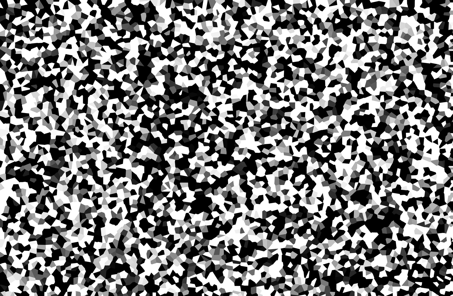
And then we’ll use the Crystallize filter to create this grayscale image. It’s none too exciting and altogether random, but as you’ll learn, that’s rather the point.
Next, we’ll apply the displacement maps—the Crystallize image and two others—to absolutely blow our dude away. I mean, just look at the poor sap. He’s a mess, with viscera everywhere and holes where human pieces should be.
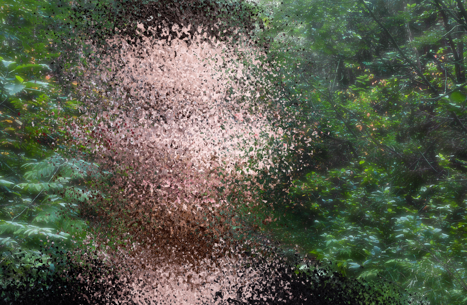
In Episode 710 (May 29th), join me as we add a tiny bit of Radial Blur along with a filter mask to bring back portions of the dude’s face. At which delicious point, we can see our hero’s face of terror.
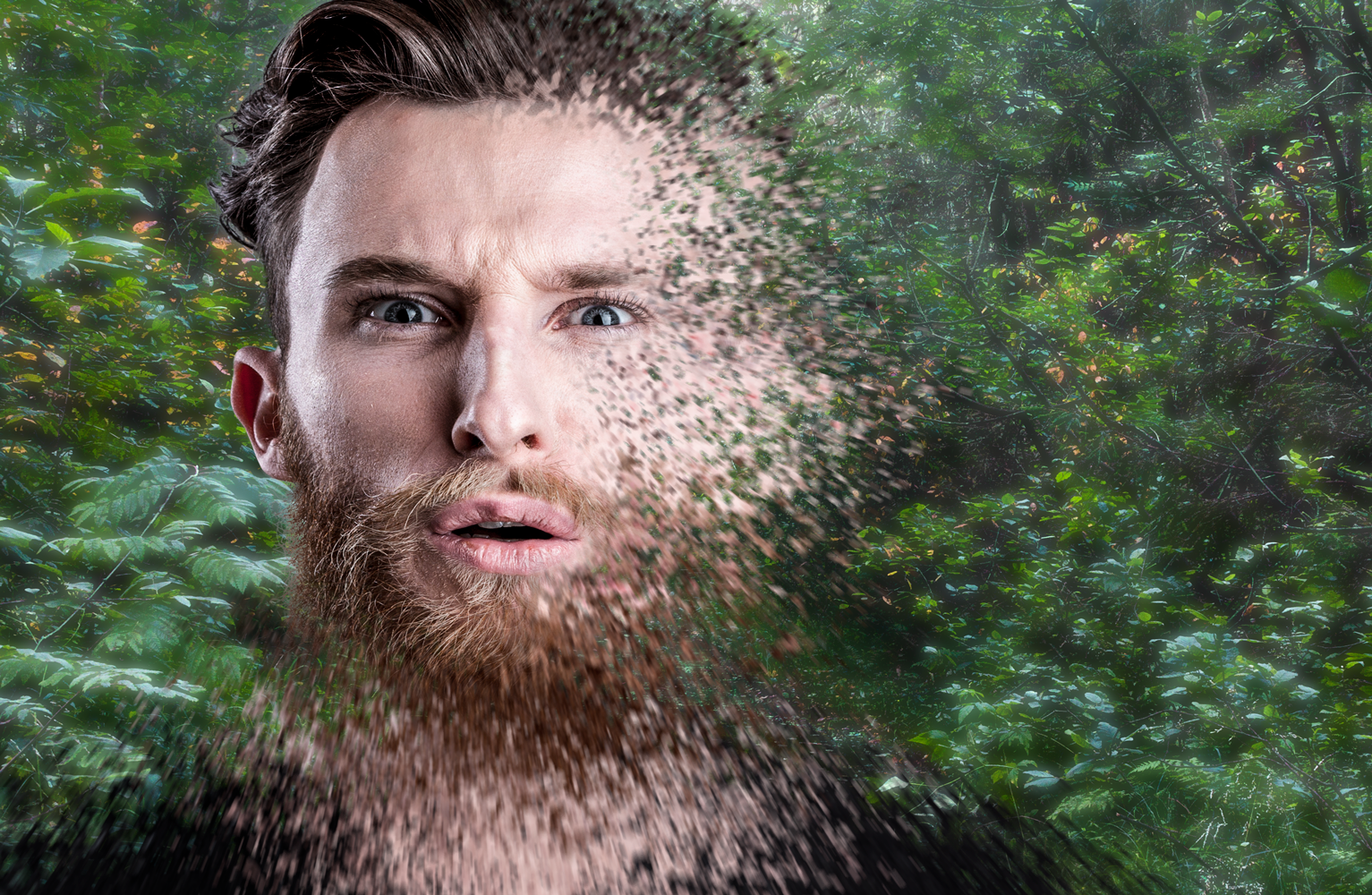
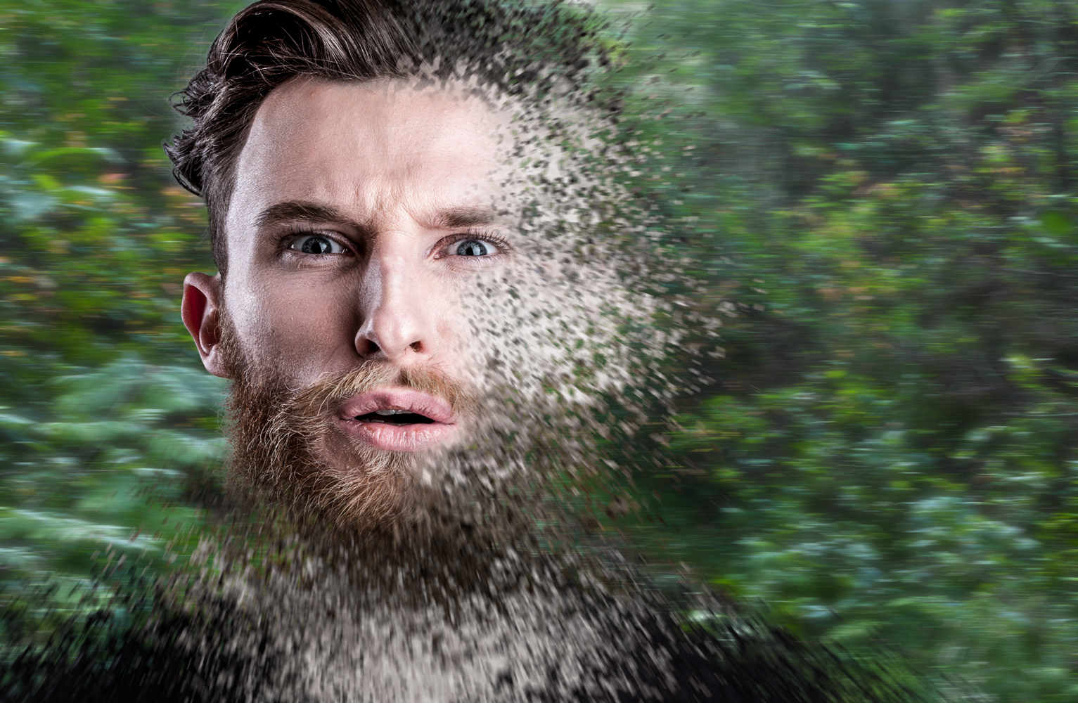
And finally, we’ll turn our flakes of human detritus the color of ash. Plus, we’ll Motion Blur the background to suggest our tragic hero spinning to his ultimate demise.
Keep an eye peeled (however painful it may be) two weeks from tomorrow, May 22, when I launch Episode 708, “The Marvel disintegration effect.” Ushering in a total of four installments of the longest-running and most popular weekly series at Lynda.com/LinkedIn Learning, Deke’s Techniques.




Pro skill set